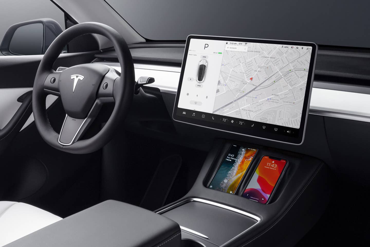
One could argue that Tesla pioneered the trend of minimalism and touchscreen-centered interfaces within the automotive sector. However, as the touchscreen trend recedes, some Tesla owners are adapting. Recently, a Tesla Model Y owner in China incorporated a panel of buttons into their vehicle, a move that has drawn significant criticism from fellow Tesla enthusiasts.
This modification was showcased in a video originating from an unknown Chinese social media platform, later spreading to Twitter. In the video, the Model Y owner added a plug-and-play button panel beneath the touchscreen to manage various functions like climate control, door locks, and trunk release. The added buttons not only enable the driver to operate these functions without diverting attention from the road but also blend seamlessly with Tesla’s aesthetics and color scheme, appearing almost as if they were factory-installed. An overall win-win situation.
However, not all Tesla owners share this perspective.
Responses to the mentioned tweet varied, with most adopting a “to each their own” attitude, while some lauded the additional buttons as an enhancement. However, a few…
- “Elon wants to drag us out of the Stone Age, but this individual is adamantly clinging to outdated methods.”
- “I detest it, it has no place in my M3.”
- “Utterly pointless…”
- “Perfect for older generations”
- “Will he also place a blackberry on top of my iPhone?”
- “Reminds me of the woman in the US who tried filling her Tesla with gas at a petrol station.”
- “Once he realizes the demand was just FUD to manipulate stock prices, he’ll be penniless.” (Author’s note: ???)
- “Looks like something from a VCR in the 20th century.”
- “Some people have poor taste.”
- “Too intricate, you might crash the car trying to find one of those tiny buttons that all look alike.” (Author’s note: ironic)
- “Not a long-term necessity. Even if you desire shortcuts, they won’t be essential. The car will anticipate your needs and act upon them, including signaling/turn-signals” (Author’s note: this is incorrect)
- “Pla no pls no we’re going backwards” [sic]
- “The majority still cling to the past. Tesla has taken a significant step to eliminate these lousy buttons. This individual should add a start/stop button and gear selector on the right console.”
The originator of the thread opposes this modification, asserting that “this addition contradicts the essence of minimalism.” Minimalism, however, is not an “essence” in itself but rather an aesthetic, a style, not a function. Regardless, this Model Y owner has enhanced the functionality of their car, albeit at the perceived expense of compromising the car’s design as some argue. (Welcome to the realm of vehicular modifications debates on the web, Tesla owners. Kindly take a stance on splitter guards in the comments.)

Tesla Model Y cockpit as shipped from the factory, with phones charging in their docks. Tesla
It’s evident that touchscreens do not always serve as a perfect replacement for physical buttons in cars, as not everyone finds aesthetics superior enough to justify functional compromises. While some vehicles, like the Lamborghini Countach, manage to eloquently blend form and function, Tesla may need to reconsider including Elon Musk in design deliberations based on the perplexing Cybertruck design direction.
Do you have tips or questions for the author? Contact them at: james@thedrive.com
